WCAG 2.1 & ADA Compliance Checker
Ensure your website meets ADA compliance standards with our advanced Color Contrast Checker – the ultimate solution for designers and developers prioritizing web accessibility.
Introduction – Color Contrast Checker Tool
Welcome to our Color Contrast Checker Tool, designed to help you create accessible, readable, and visually optimized web content. Whether you’re a designer, developer, or content creator, ensuring proper contrast between text and background is crucial for making your content inclusive for everyone—including users with visual impairments or color blindness.
This free tool instantly checks color contrast ratios based on WCAG 2.1 accessibility guidelines, helping you meet global standards and avoid usability issues. Just enter your foreground and background color codes, and our tool will show you whether the combination passes accessibility tests for normal text, large text, and graphical elements.
In addition to this tool, you might find the following resources on our website helpful:
- Beautiful Color Tool – Explore and experiment with beautiful color palettes.
- CSS Gradient Generator – Create stunning linear or radial CSS gradients.
- Hex to RGB Converter – Quickly convert HEX color codes to RGB format.
- Text to Graph Tool – Visualize data from text using AI-powered graphs.
- Length Conversion Calculator – Convert between different length units.
Our goal at OnlineTool.Free.nf is to make your workflow faster, smarter, and easier. From productivity tools like the Pomodoro Timer to calculation tools like the BMI Calculator and GPA Calculator, we have a growing library of free online utilities to simplify your tasks.
Why Our Contrast Checker Stands Out
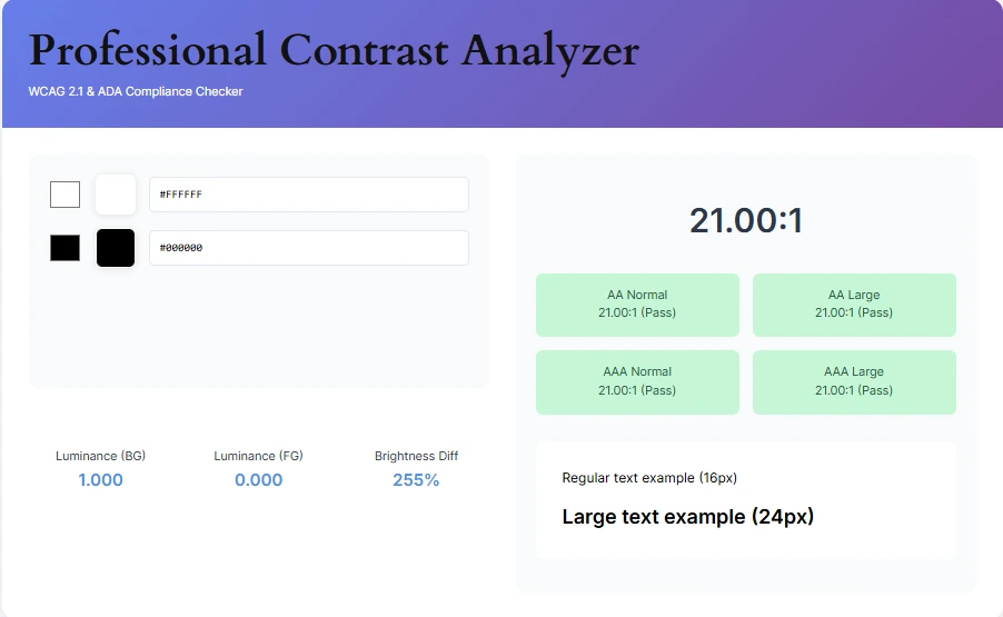
Our colour contrast analyzer goes beyond basic checks with these must-have features:
- Real-time WCAG 2.1 & ADA compliance validation
- Dual color picker with hex code support
- Luminance and brightness difference metrics
- Large/regular text preview samples
- Mobile-responsive design checker
Advanced Features for Professionals
- Compliance History Tracking: Save previous color combinations
- Color Vision Deficiency Simulator
- CSS Code Export for quick implementation
- Batch Analysis for entire color palettes
How to Use Our ADA Color Checker
- Choose background/foreground colors using pickers or hex codes
- View instant contrast ratio calculations
- Check WCAG compliance badges (AA/AAA)
- Analyze advanced metrics like luminance values
- Export results or implement suggested fixes
Pro Tip: Bookmark this contrast analyzer tool for quick access during design sprints!
| Color Combination | Contrast Ratio | Rating | Preview |
|---|---|---|---|
| 21:1 | Sample Text | ||
| 1.5:1 | Sample Text | ||
| 6.2:1 | Sample Text |
Color Contrast Checker FAQs
Proper contrast ensures readability for visually impaired users and meets ADA compliance requirements.
AA (minimum) requires 4.5:1 contrast, while AAA (enhanced) needs 7:1 for normal text.
Currently, our colour contrast verifier analyzes solid colors only.
A color contrast checker tool helps evaluate the readability of text by comparing foreground and background colors to ensure they meet accessibility standards like WCAG.
The contrast ratio is a numeric value (1:1 to 21:1) representing the difference in brightness between two colors. Higher ratios mean better visibility.
According to WCAG 2.1, normal text should have a minimum contrast ratio of 4.5:1, while large text (18pt or 14pt bold) requires at least 3:1.
WCAG stands for Web Content Accessibility Guidelines, which provide standards to ensure digital content is accessible, including color contrast recommendations.
This tool is designed primarily for checking text contrast on solid backgrounds. For images, use specialized tools that analyze visual complexity and overlays.
Our tool follows WCAG 2.1 standards and uses the official contrast ratio formula, ensuring accurate, reliable, and up-to-date results.
Conclusion: Elevate Your Accessibility Game
Our comprehensive Colour Contrast Compliance Tool eliminates guesswork from web accessibility. With features surpassing standard contrast checkers, it’s your all-in-one solution for:
- ADA compliance verification
- WCAG 2.1 standard checks
- Professional color analysis
- Accessible design optimization
“Found this color accessibility analyzer helpful? Share with your development team!”
Related Tools: